BH-97: My Childhood Home
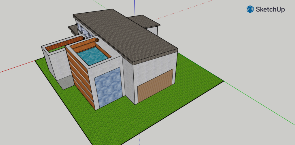
I spent Wednesday afternoon playing around with the 3-D modelling tool, SketchUp to build a replica of the house I grew up in. Although challenging at first, the platform proved to be quite engaging and interesting when I started to get the hang of how certain features worked. I’m still not completely confident in my abilities to create 3-D models using this platform, but I think with a few more attempts, I will definitely be able to conquer several of the frustrations that first sprung up when I logged into the website.
One of the most disappointing attributes of the interface was its navigability like a lot of my peers have already pointed out. I was accessing the website via my MacBook Pro and trying to construct my model using the laptop trackpad and that seemed to have been far more difficult than if I had just used a mouse for the same. Downloading custom features that had been pre-created by other SketchUp users was also challenging primarily because orienting them to fit where I wanted them to go took a particularly long time. What I did really enjoy about the tool however, was the wide array of options the creator is presented with in terms of colour choices, shapes and stylistic elements for the modelling procedure. I felt like a professional architect picking out just the right shade of brown for the garage door and the perfect tint for the glass windows.
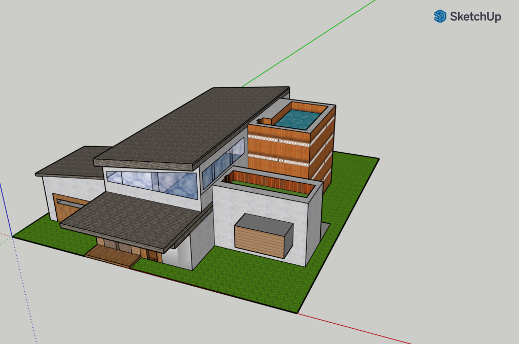
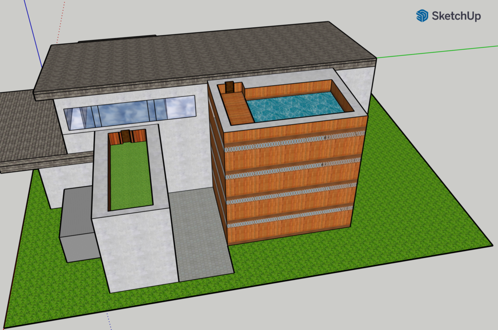
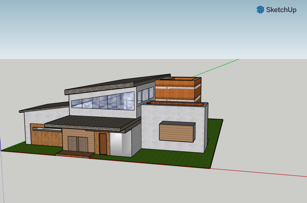
Even though I was excited about creating the perfect replica of my childhood home, I did have to make some tradeoffs given the features that were available on the platform and the tools that were accessible to me to manipulate those features. I found orienting the downloaded customised features quite difficult and had to do away with using them for my house (which is precisely why it lacks the greenery and trees that the models made by my peers have). I also found it hard to use the tape measure tool and measure the proportions of my house parts and after some trial and error just decided to eyeball it instead of using the tool for support.
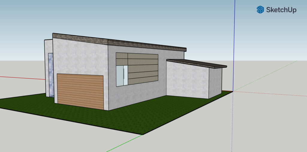
This tool seems like one that could be revolutionary in fields such as architecture, interior design and even game design. It allows third party plugins with the Extension Warehouse feature and the Pro mode of the website even offers additional exciting features which the personal free version of SketchUp lacks. Although I haven’t had prior first-hand experience with the tool, a number of individuals I am familiar with who are employed in fields relating to design seem to find it very useful and easy to operate when compared to other platforms like AutoCAD. It is a one of its kind virtual reality medium and appeals to a very large audience base. I could also see its potential use within the classroom, for example this one, to teach students about the art of modelling, visualising and design. 3-D modelling is an advanced technological breakthrough and such tools when made so accessible to us for utilisation, further go on to show how deeply technology and technical tools penetrate the classroom and enhance our learning.
TIP FOR OTHER USERS: Spend some time playing around with the available options on the platform and familiarising yourself with how they function. I discovered some very handy tools when I was already halfway into the modelling process and realised that those could have saved me a lot of time had I discovered them prior to starting on the project.
I’m excited to create more such visual models using SketchUp or other available platforms and pick up new skills along the way.
Unpacking a DH Project
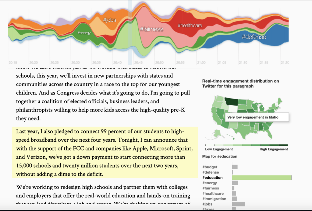
As I was scrolling through the list of DH projects to explore for this blog post, one title specifically caught my eye. “#SOTU2014: See the State of The Union address minute by minute on Twitter” seemed like a mouthful but I’ve always been interested in politics so I decided to take a look at the project. The interactive page is an attempt to visualise the realtime impact that Obama’s State of the Union Address of 2014 had on Twitter, and the reaction it generated from the masses. The colourful graphics and the engaging visuals added to the appeal of the page but I was surprised at how little was available of the background of this DH project. The context behind why this was undertaken, what the data collection process was and how the data scientists behind this project followed up with its upkeep was absent and not much about this cropped up from repeated Google searches. But I think it is still worth talking about this project, just because there are multiple cases where the lack of documentation leads to a project being dismissed and not being given the recognition it deserves. This visualisation by a member of the Twitter visual insights team, Nicolas Belmonte and data scientist, Simon Rogers, enables viewers to navigate around the speech and see the instant reaction on Twitter to each part of it – themed by geography and subject.
The source for this project was simply the large database of tweets about Obama’s speech from its Twitter page which was easily accessible to the researchers given that one of them worked for the company. Not much is available about the process of retrieving and processing this data and the tweets but since the project has the term #SOTU2014 in its name, it looks like the researchers were looking for this specific hashtag in their searches when diving into the process of creating the visual and they then perhaps proceeded to collect all the tweets that contained that search term before grouping them into the above mentioned categories.
At the very top of the page, is a multicoloured steam-graph where the colour groupings represent certain topics that were addressed during the speech in 2014. For example, green denotes education and energy, blue represents defense, and red is healthcare. The same colour groupings appear on the map of the United States on the right hand side of the website with a scale representing intensity – the darker hues show high engagement, and the lighter hues show low engagement on Twitter in regards to the specific paragraph of the speech that is being highlighted on the left hand side of the website page. There’s also a third visualisation – the bar chart that also is a different way of depicting the same data. When a paragraph is highlighted, the specific topic on the bar chart that corresponds to the topic that is most dealt with in that paragraph is also highlighted. This page was both interesting and informative, fun to play around with and revealed a great deal about public opinion of Obama and his administration.
The project seems like it stands at the junction of history, political science, digital humanities and computer science, combining elements of all these fields in the way the data is processed and presented.
I find it hard to designate a specific target audience to this interactive model but I think this is an interesting question to think about. It could be useful to researchers in the political field but could also be a fun tool for just about anybody who is interested in either the American political system or in infographics and data visualisation.
I loved exploring this project and I’d be very interested in seeing more such work and seeing how infographics are used to relay information about politics and other such fields in the realm of digital humanities.
